The post What Are the Best Practices for Designing an Effective Logo? first appeared on Read Our Blog – Webguru Infosystems.
]]>Creating the right logo is crucial, as it helps people recognize your brand and gives a unique identity to your business. In fact, according to a study conducted by MIT Sloan, effective logos can significantly impact customers’ commitment to a brand and overall business performance. In this blog post, we will explore the most popular practices to create distinctive logos that can deliver a clear message and attract potential customers.
Top Practices That Can Help You Design an Effective Logo
Let’s take a look at some of the best ways to design a great logo.
#1 Understand Your Audience
When creating a logo, it is crucial that your design expresses your offerings and the value your target audience might be expecting from you. If you don’t know who your target audience is, your potential customers might not connect with or comprehend the message of your logo. Concentrate on understanding your target audience by conducting market research, analyzing your competitors, and communicating with customers.
#2 Play Around With Letter Cases
Creating a unique logo design can be greatly influenced by small details. Although the entire process can be guided by a website design company, here’s an interesting fact: playing around with letter cases has the potential to take your trademarks and typefaces to another level.
Typically, lowercase logos exude a more casual and approachable vibe; while the use of uppercase gives off a strong message of authority. However, you can soften the appearance of uppercase text by carefully choosing your colors. Remember, it’s all about finding the right balance.
#3 Choose Your Colors Wisely
Colors play a vital role in a logo because the palette you select says a lot about your brand. For instance, the color blue communicates trustworthiness and evokes feelings of togetherness and intelligence. This is why social media platforms like Facebook have their logos in blue. Similarly, red shows excitement and passion. So, make sure that the colors you use grab the attention of your target audience as well as speak about your brand personality.
#4 Pick a Unique Design Style
When it comes to creating a business logo, every website design company devotes significant time to finding a unique and distinctive style. This is because, in order to ensure that a logo catches attention, it should have an element that is unexpected or distinct without becoming “overdrawn.” Also, you need to ensure that it’s simple but versatile and, most importantly, can be easily recognized. Some of the most sought-after styles include retro, modern or minimalist, classic, handmade, and fun and quirky.
#5 Choose the Right Fonts
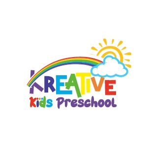
Believe it or not, the font you choose for your logo can say a lot about your business. It should reflect the personality and professionalism of your brand. For example, if your company manufactures toys, choosing a handwritten typeface for the logo would be suitable. As your target audience is children, this will project your brand as a child-friendly business. You can also incorporate elements like vibrant colors, playful characters, and interactive experiences. This will solidify your position as a trusted, child-centric entity in the eyes of both kids and their parents.
Did you know, around 75% of the 500 largest companies in the world, including Netflix and Facebook, use Sans Serif fonts in their designs? This is because serif fonts are easy to read and create a modern feel. If you, too, want to create a clear, more modern feel, go for Sans Serif fonts.
#6 Make Your Logo Memorable
Given that, every year, thousands of start-ups are launched, crafting a logo that grabs people’s attention is very important. This is because it is among the first things your potential customers will see. When customers see the logo, it needs to create a positive first impression and leave a lasting impact on their minds. And a logo that is not memorable would not be able to help you accomplish this goal. To make it memorable, you can incorporate some symbols, add some fun elements, or give a nice twist to your text-based logo.
#7 Keep It Simple
In logo design, simplicity is key. Choose an uncluttered, clean design that can communicate your brand identity as clearly as possible. Remember, your goal is to make sure that viewers can recognize your logo instantaneously. Take Nike’s logo, for instance. The logo is simply a swoosh, and it is its simplicity that makes the logo iconic. And this is the reason it has not been updated since 1995.
#8 Make Sure Your Logo Is Scalable
Easy scalability is another attribute of a great logo design. You need to keep in mind that there will be an array of advertisements featuring your logo, and it should look great as a logo across all platforms. This means that if the logo is enlarged to a bigger size on a billboard, it should look like it’s a part of the billboard design. But if the logo is out of proportion and some of its features look bizarre when displayed on a billboard, it implies that your logo is a failed design. Likewise, if a logo needs to be printed on a smaller surface, like the cap of a promotional item, the intricacies of the design must be visible.
Conclusion
Your logo serves as a cornerstone for your marketing and communication efforts. It is featured on everything, from business cards and website banners to social media posts and product packaging. This makes it very important for the logo to be well-designed. A logo that is distinct and easy to recall can capture attention and set your brand apart from others. By integrating logo design services and following these practices, you can have a logo that not only looks good but also effectively captures the essence of your brand and resonates with your audience.
The post What Are the Best Practices for Designing an Effective Logo? first appeared on Read Our Blog – Webguru Infosystems.
]]>The post Most Effective Ways to Make Your Brand Stand Out in 2024 first appeared on Read Our Blog – Webguru Infosystems.
]]>Considering the array of choices available to consumers, businesses need to be creative to distinguish themselves from competitors and cultivate brand loyalty. Accomplishing this necessitates a comprehensive comprehension of prevailing trends. Let’s explore some of the most effective strategies that can elevate your brand and guarantee its distinctiveness in the face of competition.
10 Most Effective Ways to Make Your Brand Stand Out in 2024
Here are some tips that will help your brand thrive in such a competitive landscape:
#1 Acknowledge Authenticity
Successful branding relies heavily on authenticity. So, if you aspire to distinguish your brand amidst the clamor and captivate attention, it is imperative to prioritize sincerity, transparency, and honesty in your brand messaging. Today, customers actively pursue authentic connections with brands that align with their values and ideals, surpassing mere products or services. This means developing authentic connections with your audience rather than relying just on flimsy marketing strategies. You can consider providing exclusive access to your business’s workings, telling the unique tale of your brand’s inception, and genuinely interacting with your audience across a variety of media.
#2 Create a Memorable Visual Identity
Crafting a remarkable visual identity can help you elevate your brand by offering a distinct and instantly recognizable image of your company. A visually mesmerizing brand identity can effectively convey your brand’s principles and exclusive offerings to your intended audience by utilizing strategic design elements like logos, color schemes, typography, and imagery. Partnering with a reputable logo design company can also be instrumental in creating a captivating visual identity that resonates with your target audience. These experts specialize in translating your brand’s values and unique selling points into visually compelling designs that leave a lasting impression on your customers.
With that being said, while designing a logo, it’s important to consider the logo’s forms and colors. Both are crucial components of logo design that influence how customers perceive it.
#3 Do Competitive Analysis
Competitive analysis helps identify opportunities that may have been overlooked. A brand can find untapped markets, new trends, or unmet consumer requirements to capitalize on by studying the strategy, market positioning, and customer feedback of competitors. Added to that, analyzing the marketing strategies used by other companies can reveal important information about what attracts and repels customers. A brand can improve the targeting, messaging, and channels of its own marketing initiatives by studying those of its competitors.
#4 Create Compelling & Engaging Content
Customers can be significantly influenced by engaging storytelling, which has the power to win them over. Because of this, companies must create narratives that their target audience can relate to by incorporating elements of purpose, authenticity, and emotion. Whether an organization wishes to convey its values and vision through video content, social media posts, or brand narratives, storytelling can be an extremely effective approach. In such a scenario, engaging content writing services can be a strategic decision to create stories that captivate readers and make a lasting impression. Employing experienced content writers helps companies utilize compelling narratives to successfully communicate their brand’s values, objectives, and unique selling propositions. This fosters stronger relationships with target audiences and eventually increases consumer loyalty.
Are you curious to learn what video marketing is and how to use it to achieve the greatest outcomes? Well, check out our blog. It outlines all the important aspects that you need to know about video marketing.
#5 Develop a Unique Brand Voice
Consistency plays a pivotal role in establishing a robust brand voice. It guarantees that your messaging remains consistent throughout various touchpoints, such as your website, social media accounts, promotional materials, and customer interactions.
Did you know, a logo plays a crucial role in creating a unique brand voice? A logo, while primarily a graphical component, captures the values of your company and serves as a powerful representation of who you are. That’s why working with a trustworthy logo design company is so valuable. They possess the knowledge and artistic ability to transform your brand’s essence, personality, and goals into an enthralling and memorable design.
#6 Embrace Immersive Experiences
As virtual and augmented reality technologies progress, brands can seize the chance to fabricate captivating experiences that engross audiences. By developing engaging and memorable 360-degree video content, AR-powered commercial demos, or interactive VR experiences, you can capture the attention of your audience. You can also organize online events, like interactive seminars or new product launches, to engage customers worldwide and provide distinctive brand experiences.
#7 Build a Strong Online Presence
If one desires to enhance audience engagement and visibility, it is imperative to possess a robust online presence in this era of digitalization. To achieve this, you need to ensure the optimization and user-friendliness of your website. Further, the implementation of SEO best practices can enhance your website’s visibility in search engine results. Using relevant keywords, optimizing meta tags, creating high-quality content, and building backlinks from reputable sources are all essential components. You can also consider utilizing content writing services to generate informative and superior content. The experts will provide you with content that not only connects with your target audience but also enhances your website’s search engine rankings.
#8 Prioritize Sustainability
Brands must acknowledge that sustainability is not a passing trend, but a fundamental necessity. They must diligently embrace actions to mitigate their ecological footprint, whether it be through the incorporation of eco-conscious packaging, the execution of renewable energy initiatives, or the utilization of ethically procured materials. By effectively and consistently communicating their resolute dedication to sustainability, brands can exhibit their unwavering commitment to responsible conduct.
#9 Leverage AI and Personalization
Without a doubt, artificial intelligence is transforming the way brands interact with their customers. Brands can customize the consumer experience with tailored product recommendations and marketing campaigns by utilizing various kinds of AI-driven technologies. Furthermore, the application of machine learning and data analytics also facilitates the provision of relevant content and solutions that correspond with individual preferences and behaviors.
#10 Encourage Community Involvement
Encouraging a robust sense of camaraderie within your organization leads to consumer advocacy and loyalty. Thus, it is critical to give top priority to community engagement programs, including online forums, user-generated content campaigns, and exclusive events. Further, it is also important to encourage conversation, pay attention to criticism, and provide your community with the tools they need to become strong brand advocates.
Conclusion
Implementing the right strategies enables you to stand out from the competition and increases the likelihood that consumers will notice and remember your company in a fiercely competitive marketplace. By utilizing a proficient strategy and engaging corporate identity design services, one can establish a remarkable and uniform brand presence throughout all points of contact, thus enhancing its competitiveness within the market.
The post Most Effective Ways to Make Your Brand Stand Out in 2024 first appeared on Read Our Blog – Webguru Infosystems.
]]>The post The Subconscious Influence of Colors and Shapes in Logos first appeared on Read Our Blog – Webguru Infosystems.
]]>Not only did these brands grow by developing strong connections with their audience and customers over time, but their unique logo also played a part in distinguishing them from their competitors. When it comes to establishing a strong brand identity, investing in high-quality logo design services is a smart choice for any business. It should be noted that by making thoughtful branding decisions and striking logo designs, they become successful in getting their audience’s attention. “Logos are essential for developing brand identity because they provide a recognisable and memorable symbol that 75% of consumers associate with a particular company or product.” (Source: Linearity)
That’s why we’re going to find out what psychological and emotional implications colour, shape, and font can have on logos.
Reasons to choose certain brands amidst several others in the market
Imagine yourself in a general shoe store, buying sportswear for your upcoming vacation. After making your choice based on your size, you are now heading to the cash counter to make the payment and head back home. This is a common scenario for anybody buying their shoes, but few ask themselves why they pick a particular shoe out of the rest of the collections. Is it entirely because of the colour? Only for the low price? Find the few factors that we consider when buying a product or service from the market in the points given below.
- Brand loyalty
- Self identification
- Social identity
- Familiarity
- Status
- Social identity
- Emotional associations
It needs to be understood that when assessing brands, customers are more inclined to make a choice that appeals to their emotions. Having said that, it’s essential for a company to convey their brand’s identity in an appealing way to their target audience. On the other hand, it is also true that busy shoppers don’t have the time to do detailed research every time they’re making a buying choice. Such purchase decisions are entirely instinctive and based on emotion.
For instance, if you are in a grocery store and they’ve run out of your favourite biscuit brand, what will you do next? You will naturally look for other biscuit brands of the same nature. In that case, you might go for something above your usual budget as an exception to try something new. In such scenarios, the visual identity of the products, especially the appearance and the logo, is what influences you to make a choice. That’s why an effective logo design is significant, as you have a mere few seconds to get the attention of the customer.
Colour Psychology in Logo Design
One of the most potent components of logo design is colour. It has the ability to elicit strong feelings, transmit messages, and change people’s behaviour. As different colours elicit different psychological reactions, astute designers take advantage of this fact to craft logos that appeal to their target market.
First, let’s talk about the colour red, which is frequently connected to passion, vigour, and excitement. Red is a vibrant, dynamic colour that is used in logos by companies like YouTube and Coca-Cola to compel viewers to act. Conversely, blue conveys a feeling of professionalism, dependability, and trustworthiness. Blue is used in the logos of tech behemoths like Facebook and IBM to imply competence and stability, giving their audience confidence.
Read our blog, Create an Impactful Logo Following the Neuro Design Principles that tell which artistic elements in a logo impact the subconscious mind.
Another interesting colour option is yellow. It stands for creativity, warmth, and optimism. Companies including McDonald’s and IKEA use yellow in their logos to evoke positive emotions and creativity, which increases consumer interest in their goods and services.
Green is frequently used by brands in the eco-friendly and wellness sectors because it is typically connected to nature, growth, and health. Green is a popular colour for logos used by businesses like Whole Foods and Starbucks to represent freshness, sustainability, and wellbeing and draw in eco-aware customers.
The psychology of colour encompasses not only single colours but also contrasts and combinations of colours. Analogous colours, like various shades of blue or green, imply harmony and coherence, while complementary colours, like red and green or blue and orange, produce a striking visual impact. By having a solid understanding of colour theory, designers can create logos that subconsciously appeal to their target market and shape their attitudes and actions.
Shape Psychology in Logo Design
A logo’s forms and symbols, in addition to colour, are very important in influencing how a customer perceives it. Shapes also carry psychological connotations of their own, each evoking unique feelings and meanings. Colours also have psychological connotations.
Think about the circle, a form that is frequently connected to harmony, wholeness, and unity. Circles are incorporated into logos by companies like Target and BMW to represent inclusivity, perfection, and continuity, appealing to consumers’ need for harmony and connection.
Conversely, squares and rectangles stand for dependability, stability, and order. Companies such as Microsoft and Adobe use these shapes in their logos to project a sense of reliability, professionalism, and solidity, thereby establishing themselves as leaders in their respective industries with a solid base.
Triangles represent aspiration, advancement, and growth because of their dynamic and upward-pointing orientation. It’s a shape that is also used in logos by companies like Adidas and Delta to inspire consumers to push boundaries and achieve new heights by conjuring up ideas of innovation, movement, and aspiration.
Customers’ perceptions of a brand’s personality and values can also be influenced by the shapes and symbols used in its logo. Geometric shapes communicate efficiency, structure, and precision; organic, flowing shapes evoke creativity, flexibility, and authenticity. Designers can produce a unified visual identity that subtly appeals to consumers by coordinating the shape of a logo with the brand’s identity and message.
Final Thoughts
To sum up, companies can use the psychology of colour and shape to their advantage to create a logo that will engage their audience more deeply. Through an awareness of the psychological connotations associated with various hues and forms, designers are able to produce logos that elicit particular feelings, transmit significant messages, and impact consumer behaviour. A logo can be transformed from a simple symbol into a potent brand asset that connects with customers and makes an impression by strategically utilising colour and shape psychology. This can be achieved by utilising warm hues to evoke feelings of passion and excitement or by incorporating geometric shapes to convey stability and reliability.
Brands can effectively communicate their personality, values, and message to their target audience by utilising the psychology of colour and shape in logo design. This creates strong emotional connections that encourage brand loyalty. That’s why businesses look for a logo design company in India so that they can draw their audience’s attention towards their products and services. With so many options and distractions available to consumers in today’s competitive market, a well-designed logo that subconsciously connects with them can make all the difference in grabbing their attention, establishing credibility, and propelling success.
The post The Subconscious Influence of Colors and Shapes in Logos first appeared on Read Our Blog – Webguru Infosystems.
]]>The post 12 Modern Logo Design Trends for 2023 first appeared on Read Our Blog – Webguru Infosystems.
]]>A great logo is one that people can easily identify anywhere and everywhere, and get reminded immediately of your brand and their experiences with it. This is a big ask, and incorporating popular trends into a brand-new logo is a challenge to logo design services everywhere. However, there’s inspiration all around us as new trends keep arising.
Logo Design Trends in 2023
Overall, the trends in logo design in 2023 are likely to be characterized by a balance between simplicity and creativity. Companies will try to make an impact with logos that stand out and are easy to recognize. Here are the logo design trends that you should keep a watch out for in 2023.
1. Bold & Vibrant Colors
Logo design has been trending away from the use of muted tones and instead towards a more vibrant, bold color palette. This trend is based on a number of reasons, including the fact that people are much more likely to remember colors that are in high contrast with their surroundings.
Some say that it’s because digital devices now allow for much louder and higher-contrast designs than ever before. Brightening up a logo can make it easier to read on screens of all sizes, from small phones to large monitors. It also makes the brand more visible in bright sunlight or on brightly colored backgrounds. Marketing research has also shown time and time again that colorful logos are associated with positive brand associations (such as being innovative or fashionable).
You may check out this infographic to know more about how to use colors in logo design.
2. Negative Space
Negative space is a trend that is seeing increasing use in logo design. It refers to the spaces around a letter, figure, or other graphic elements that have been intentionally left empty to create an overall effect of balance and harmony.
The power of negative space can be seen in both small and large logos. In smaller logos, it can help to create a sense of intimacy by emphasizing the elements within the design. In larger logos, negative space can provide stability and strength by creating an illusion of depth. The logo of WWF is a great example.
There are many different ways to use negative space effectively in your logo designs. Try experimenting with different depths and textures until you find something that works best for your particular project (and aesthetic). You may also want to consider using light instead of dark colors throughout your logo layout for added contrast and visual interest.
3. Glitch Effects
Glitch effects are a popular trend in logo design these days, and for good reason. They can add an extra level of sophistication and dimension to a design, making it look more futuristic and creative. Plus, they’re easy (and fun) to incorporate into your designs without having to spend hours trying to create them from scratch. TikTok’s current logo is a very identifiable example of this trend.
Glitch Effects work best when they are subtle – avoid overdoing them or the effect will become too noticeable rather than enhancing the overall look of your logo. Use blends and textures wherever possible to create depth and complexity within the graphic elements of your logo. Add glints, sparkles, static displays, wobbles – anything that makes your design feel alive and dynamic.
4. Gradients

The use of color gradients in logo design isn’t exactly a new trend. However, it isn’t a trend that is expected to go away any time soon. Think of Instagram’s current logo, and how instantly identifiable it is.
This trend is especially noticeable when it comes to fonts, as gradients are often used to give a typeface a softer or warmer look. There are many reasons why color gradients can be effective in logos – from adding depth and dimension to designs, to creating a sense of unity and symmetry.
So, how do you go about using color gradients in your logo design? The simplest way is usually by starting with an existing logo and applying the gradual changes gradually over time (or using presets). You can also experiment with different colors and shades within the same gradient, or mix various gradients together for an even more intricate effect.
5. Geometric Patterns
Geometric shapes and patterns are becoming increasingly popular in logo design. They can help to create a striking, unique look that is sure to catch attention. Some of the most common geometric shapes used in logos include circles, triangles, squares, and rectangles. These shapes are often combined with simple but effective color schemes to create eye-catching designs. Think of the current logos of Adobe and Mitsubishi, for example.
There are many benefits to using geometric designs in your branding strategy. First of all, they tend to be visually appealing and easy on the eyes. Second, they can communicate simplicity and strength simultaneously – two important qualities for any brand’s logo design portfolio. And last but not least, geometric logos are highly resistant to visual fatigue – which is great news for businesses that want their logo to stand out from the competition.
6. Monograms
Monograms are quickly becoming a popular way to add personality and design flare to your logo. They’re also an excellent way to tie in the company’s mission or values with its branding. Plus, monograms can be used as a unique identifier for your brand online and off.
There are several reasons why monograms make sense as part of a logo design strategy. For one, they impart both visual appeal and staying power when displayed on products or websites. Monogram designs also tend to be more memorable than standard logos – which is important if you want people to remember your brand easily even after only seeing it once. Plus, they can act as icons that help shoppers differentiate between similar brands while searching online or through catalogs or store shelves.
7. Disappearing Text or Objects

Vanishing text and objects are becoming increasingly popular in logo design. This trend is based on the idea that by using disappearing texts or objects, companies can create a more mysterious and attractive brand image. It can be used to create a sense of depth, or to emphasize certain elements of the logo.
It can help to attract new customers by creating an aura of mystery around your brand. It also makes your logo look more dynamic and modern, which appeals to consumers who want their logos to reflect current trends. It can also be effectively animated into a GIF for your website or app, with the vanishing effect becoming more prominent.
8. Minimalism and Minimalist Symbolism
Minimalism is an aesthetic movement that emphasizes the use of simple, uncluttered designs. It first emerged in the early 1990s as a reaction to over-the-top branding and excessive ornamentation in contemporary design. Minimalist symbolism draws on basic geometric shapes and colors to create minimalist logos that are easy to identify and remember. Think of the current logos of Papa John’s, BBC, or Apple. The idea is to establish a brand identity powerful enough to convey all the necessary information through very little visual stimulation.
Minimalism is sleek, modern, and appeals to a wide range of people. Plus, it can be incredibly effective when used correctly in logos. Here are six tips on how to use minimalism effectively in your logo designs:
- Use simple shapes and basic colors that are easy to understand. This will help make your logo look more professional and polished.
- Choose a font that is legible but not too flashy or attention-grabbing. Stick with classic fonts like Helvetica or Arial instead of trendy options like Comic Sans or Impact Cyrillic
Read more: Gestalt Theory in Logo Design
9. Layering
Layering is a popular trend in logo design, and it’s becoming more and more popular all the time. It’s simply using different layers of colors or textures to create a complex visual effect. Layers can be used to create depth, add emphasis to certain elements, or just make your logo look visually interesting.
- It gives logos a more intricate and detailed look. By using multiple layers of color, you can create an image that is difficult to reproduce with just one color alone. This makes your brand seem high-quality and sophisticated.
- It creates contrast. Different colors together often result in a brighter overall image – which helps draw attention to your logo.
10. Abstract and Creative Typography
Typography can be used in a number of ways to create an eye-catching logo. Some designers prefer to use weird, abstract, and colorful typography in their logos simply for the fun of it. Others believe that this type of typography can help to set their brand apart from the competition.
Different typography can add personality and excitement to a logo design, making it more immersive and engaging. Objects and wavy lines interspersed into text can really make it stand apart. Abstract typefaces tend to be less legible than traditional typefaces, which can make the logo harder to read. On the other hand, brightly colored fonts can inject some life into a drab or boring logo.
11. Hand-drawn Elements
Hand-drawn elements can add a sense of personality and uniqueness to a logo design. These elements can be created using traditional drawing tools like pen and paper, or digitally using a graphics tablet. Unlike vector-based graphics, which are precise and geometric, hand-drawn elements have an organic, imperfect quality that can give a logo a more human touch.
While digital design tools have made it easier to create professional-looking graphics, there is still a place for the imperfection and personality of hand-drawn elements. These elements can help a logo stand out and differentiate a brand from its competitors. In 2023, we may see more logos incorporating hand-drawn elements as a way to add a touch of personality and authenticity.
12. Retro & Vintage
Retro and vintage designs can bring a sense of nostalgia and history to a brand. These designs often draw inspiration from past decades or styles, and can include elements such as retro fonts, vintage color schemes, or design elements from a specific era.
While many companies opt for modern, sleek logos, there is still a place for retro and vintage designs. These designs can be particularly effective for companies that want to evoke a sense of tradition or heritage, or for those that want to differentiate themselves from more modern competitors. In 2023, we may see more logos drawing inspiration from the past as a way to tap into these emotions and associations.
It’s important to note, however, that retro and vintage designs can also feel dated or out of touch if they are not used appropriately. It’s important for companies to consider their target audience and brand image when deciding whether a retro or vintage design is right for them.
Read also: Using Neuro design to Create Impactful Logos
Conclusion
From negative spaces to gradients to bold solid colors, the possibilities are endless. There are several fascinating trends to explore when it comes to making a logo for your company. In 2023, designers will likely try to employ graphical elements and modern fonts in order to find the most efficient and winning solutions.
The post 12 Modern Logo Design Trends for 2023 first appeared on Read Our Blog – Webguru Infosystems.
]]>The post How to Design the Perfect Brochure: Effective Tips first appeared on Read Our Blog – Webguru Infosystems.
]]>Identifying the objectives and the target market are some of the first steps to handle some of the obstacles that may come along the way. So, how exactly do you design an awesome brochure? Well, by the end of this blog, you’ll have a clear insight into how to design an effective and unique brochure that creates a long-lasting impact on your target audience.
Perfect Ways to Design an Effective Brochure
1. Analyse the Objective
The first and foremost step is to decide on the central purpose of your brochure. Do you want to promote a particular service? Sell a new product? Showcase your best offers?
Putting in the time to plan out your brochure will not only save you from wasting time and money but will also help you to determine the amount of content that the brochure will include. Being clear about your objective and the message that you want to convey in your brochure will help your customers understand exactly what you have to offer.
2. Define your Target Audience
When designing your brochure, think of the intended audience and figure out what information they are looking for. If it is to promote a sale, it needs to be visually appealing. Alternatively, if the brochure is designed to provide technical information, it needs to be carefully detailed.
For instance, a brochure for the summer camp of a middle school is directed at both potential students and their parents. Whereas, a brochure for a Master’s degree program will be directed at people who are already graduated and matured.
3. Brochure Fold
You might think “Well, isn’t there just one brochure-type… you know, like a brochure?” The answer is a big NO! When it comes to brochure folds, choose a type that matches your industry and best fits your campaign. Some of the most popular types include bi-fold, Z-fold, roll fold, Single/double gate fold, etc.
Make sure the fold complements the type of content you include in the brochure and the way your target audience reads it. You may also engage professional brochure design services to get a creative and feature-rich brochure.
4. Copywriting
An effective brochure copywriting communicates information. Make sure that the content mentioned in the brochure is in line with what your target readers want to read. Also, it’s important is understand that too much text is not a good idea in a brochure. You can use headers, brief paragraphs, and short sentences to make it more appealing to the clients.
5. Perfect Fonts
Fonts determine the readability of your text, sets the tone of your brochure, and enhances its visual appeal. Incorporating too many fonts in your brochure makes it look messy and unprofessional. That’s the reason why the professionals of brand identity design services recommend using one or two variations. However, you need to make sure it blends with the style of the rest of your design elements as well as the brand image.
One more thing, take into consideration the font size you are using. You definitely wouldn’t want to select something that’s too big to blind the readers or something that’s too small to strain the eyes.
6. Call-To-Action
Arguably, the call-to-action is the most important section of your brochure. This is the part where you lead your readers to an intended action and gets you closer to accomplishing your goal.
Make sure not to bury the CTA in a pile of text. You can use visual cues like a different font, colour, or larger white space around it to make it stand out and grab the readers’ attention. You can also incorporate the following contact information in your brochure:
- Website
- Address
- Social Media Accounts
- Phone Number
7. Type of Paper
If you want to make a great impression and promote a distinct corporate identity, be a little careful with the quality of the paper you are going to use. For more customers, your choice of paper can influence their perception of your company.
Paper that is a bit heavier will make the brochure look sturdier and also have better durability. It may be a bit costlier than regular ones, but it will show that you care for your brand and made an effort for your readers.
8. Fascinating Graphics
Intriguing visual elements can be a perfect way to communicate with your target readers. You just have to use compelling illustrations to convey the story. Incorporating such high-quality elements in a brochure ensures that the readers feel the urge to pick it up and read every single word. However, it’s important to choose suitable pictures connected with the theme of your business. So, choose wisely!
Final Thoughts
Now that you have learned all the best ways to create an effective brochure, there’s no excuse not to. A good design will drive readers to read all the content on the brochure. On the other hand, a less-than-stellar design may end up in the dustbin. So, to make sure you get the best results, engage a professional brochure design company. Starting from conceptualization to the actual design of the brochures, the experts will take care of everything.
The post How to Design the Perfect Brochure: Effective Tips first appeared on Read Our Blog – Webguru Infosystems.
]]>The post Logo Design Trends 2021 – Webguru Infosystems first appeared on Read Our Blog – Webguru Infosystems.
]]>Today, we are here with the top trends you should start following sooner or later. And we all agree, the sooner the better, right? Stay ahead of the competition with these logo design trends.
Emerging Trends in Logo Design
-
Asymmetric Design
2021 and beyond are the years of asymmetry. Gone are the days when brands used to favour flawless design with every line drawn carefully following a grid. It’s time to break the rules and experiment with the design. Abstract illustrations are rapidly gaining popularity. The asymmetric design looks more natural and the designers can be as creative as they want without paying heed to the gridlines. A composition, free from the structured grid makes the logo look chaotically beautiful. This juxtaposition of chaos and harmony is to become the epitome of the logo design in 2021 and beyond.
However, a reputed logo design professional mentions that a logo is always about calculation. There’s always a symmetry even in a chaotic design or asymmetry. The designers are not careless while shaping the design. They have to pay attention to the overall appeal of the logo, the negative space around the borderline, the space and shape of the logo and so on. An asymmetric logo design is not an immature artist’s play. It demands even more proficiency to go beyond the traditional grid and reflect beauty through an asymmetric design.
-
Motion Design
This is a bit extraordinary design – very much akin to the modern age. Usually, we see and consider a logo to be a static image with multiple elements. However, as animation and video are becoming the integrated parts of the digital realm, logo design is adopting these elements gracefully.
Motion design operates on one simple principle – the more we stare at an object, the better we remember it. A motion design encourages people to wait for the moving element to stop. Naturally, they will retain the memory of the logo for a longer time than a static design. And retaining the memory of a logo equals to an enhanced brand memorability.
By now, you must have understood that neuro design principle is a crucial element in logo design. Animation logo also capitalizes on that.
-
Simple Geometrical Shape
Minimalism is everywhere these days. This trend is only to evolve in the coming years. A minimalistic logo design centres around the linear shapes and elements. Chic brands and enterprises prefer to use thin lines in logo design to create a sophisticated appeal. However, a minimalistic design is not simplistic. It requires profound expertise to sketch an entire logo and convey a message by using thin and sharp lines.
Simple geometric shape evokes a positive impression in the viewers’ mind. Such designs are free from the abundance of colours and these produce a clutter-free visual appeal. While bold and block lines find their usage in logo design, slim and fine lines can instantly pose a brand out from the crowd.
-
Unique Colour Scheme
A thorough understanding of the colour wheel comes in handy while designing an out-of-the-box logo. In the coming years, you will witness massive experimentation with colours. From pastel shades to vibrant hue – graphic designers are playing with all shades of colours.
These days, brands prefer to display multiple colours through the logo to add vibrancy and youthfulness. Whether it’s a combination of electric blue and white or peach and maroon – the colours of the logo must reflect the identity of your brand.
-
Quirky Character
Anything quirky gives an added kick. That’s why companies, especially the start-ups, prefer to use out-of-the-box designs for their logo. Exaggerated humour and caricature instantly grab the viewers’ attention. However, a quirky design demands immense creativity and technical understanding. The figure must be easily understandable since you cannot expect your viewers to deeply scrutinize your logo. You need to engage their attention instantly and encourage them to appreciate it for the next few seconds.
Further, a logo should have a connection with the brand image. If you are using a grinning monster in your logo, there should be a symbolic association with the nature of your brand. The use of contrast colour will further enhance the vividness of the logo. You may engage professional logo design services to craft such a logo with dexterity.
-
Use of Gradients
Gradients instantly change the outlook of a logo. This element has received huge popularity these days. Thanks to the advancement of technologies, graphic designers can experiment with different hues in the gradients. Curiously, the gradient was one of the main elements in the 80’s design and the trend seems to have rekindled once more in a modern style.
Gradients allow the designers to play with the logo. They can switch between different colours and also increase or decrease the brightness of one hue. Instagram and Redmi are two popular examples of these types of logo. Some other examples of a gradient logo design include GuitarTuna, Common App, and GarageBand.
Gradients add an interesting visual effect to make the logo look original and fresh. These also offer a depth and dimension in the logo design. The wave-like attribute provided by the gradients offers an immersive experience to the users.
-
Retro Style
Retro is evergreen. Curiously, many of the 80’s and 90’s retro designs are making a comeback in the contemporary times. Its dimmed colours, simplicity of shapes, and a growing nostalgia can pose as the reasons behind its comeback. Such a style gives space for the new-age typography. Therefore, you can experiment with the typography and keep the overall design simple while using a retro style. Such logos draw attention due to their exquisite style along with the use of random (not haphazard, though) art strokes.
Retro art merges age-old heritage and innovative approach. Such a design carries a sense of hybridity that can be associated with most of the brands. The best part is that such design instantly builds a connection with the audience and grows a sense of nostalgia and tradition.
-
Overlapping Elements
Overlapping is a great tool to use two or more designs. It also paves way for an added depth and dimension in the image. Logo designers prefer to use overlapping in order to establish a connection between two distinct elements.
The best part is that overlapping can be done with literally anything. The technique can be used for layering one colour upon another, combine two distinct elements, repeat a text in a distinct colour or design (say, a thin design on a bold design), and so on. However, you must remember that overlapping is not mixing two things. When you are overlapping two distinct colours, you are not mixing the two colours. There can be a transition point, but individual colours must pop through the design. During overlapping, you must keep the individuality of the distinct elements intact.
Way Forward
It’s remarkable to see how logo design has evolved through the years. Every new trend in logo design bears a connection with the past all the while paving way for an innovative future. Implementing these trends in your logo design sure makes it stand out from the crowd. Remember, once you craft a logo, you are not supposed to change it frequently. Though it is basically a small graphic symbol, it carries immense significance for your brand. It reflects your brand identity. So don’t forget to go an extra mile while designing a logo for your brand.
We hope the blog has offered you some useful insights. Try these and thank us later!
You may also read our other blog on 5 Principles – How To Design A Great Logo.
The post Logo Design Trends 2021 – Webguru Infosystems first appeared on Read Our Blog – Webguru Infosystems.
]]>The post Why Brand Identity Design Isn’t What You Think It Is first appeared on Read Our Blog – Webguru Infosystems.
]]>Everyone knows that – nothing new.
The problem is, most often, people are confused about the concept of brand identity. If you think a brand identity is some of the visual elements like website, logo, product packaging, and such – you are not on the right track, my friend! And it’s very likely that you are going to waste a lot of money without any gain.
Let’s cut through the confusion first. Brand identity depends on how people perceive your brand. When we drop some names like Nike, Google, BMW, or Chanel – you immediately associate some ideas like reliability, sophistication, trendsetting with these, right? This is what brand identity is.
Now, does it occur naturally? Nope, you have to create it. Brand identity relies on how you position your brand. Today, we will walk you through a few elements on which you must pay attention so as to create a strong corporate brand identity right from the budding days of your business.
Steps for an Exceptional Brand Identity Design
- Change in Logo Design
We said the logo is not the only factor to establish your brand identity, but it indeed is a crucial factor. So, let’s start with this. The interesting point to note here is that the trends in logo design are continually changing. Put substantial time and thoughts in designing a logo and consider it to be a one-time thing. Don’t change your logo frequently as it affects brand recognition and memorability.
Of course, you can take some creative liberty from time to time to engage the audience. For instance, McDonald’s has separated the arches in the logo during the pandemic to denote social distancing. And you all know how Google plays with its logo every now and then. As you may have noticed, all of them are renowned brands. Wait until you reach somewhat of a similar level before experimenting with the logo. Initially, settle for a time-tested logo design. You may seek assistance from professional logo design service providers for creative ideas.
- Professional Touch in Corporate Presentation
As your business starts to grow, you must need to communicate your proposals and pitch ideas to your prospective clients in an engaging manner. Do away with the age-old monotonous PowerPoint presentations in favour of attractive designs, smart pictures, graphs and readable content to beat the rising competition. A little pinch of professional touch can set you apart from the rest and make your presentation really impactful. Nowadays, there’s an increasing demand to engage corporate branding services to create customized presentations without breaking a sweat.
- Focus on Video Creation
Studies reveal that videos are way more engaging than text-based content or even images. Videos engage the viewers for a long time and they can effortlessly consume more information without even recognizing any effort. It’s better to promote your products and services through engaging videos so as to attract people. Focus on creating high-quality videos with catchy audio and visuals. Video is an excellent weapon to establish a distinct brand identity.
- Refine Your Website
Your business website is the destination for the leads to learn more about your services. Instead of having a text-heavy and clumsy website with outdated graphic designs, focus on developing an interactive and responsive website that keeps up with the latest trends. From typography to background colour – everything should sync with your brand image. For instance, bold fonts go well with a sports brand while cursive fonts are ideal for a salon website. Got the difference?
- Don’t Skip the Brochures
So, you have had an outstanding business conference but what happens when that is over? How can you make your clients recall you? Don’t leave things to the chances that they may (or may not!) visit your website after returning to their home. Brochures and product catalogues can come to your assistance at this hour. Make sure that the designs of these promotional materials are appealing and impressive as these will carry your brand identity.
- Branding for B2B Industries
For a long time, B2B (Business to Business) businesses used to feature a gloomy and serious tone – much different from the exciting presentations of most of the B2C (Business to Customers) businesses. We are pleased to see a change in this situation as B2B businesses, too, are paying attention to create an engaging market presence. This is extremely vital in the contemporary age where the black-and-white distinction between the two types of business verticals is gradually fading.
Digital Marketing on the Right Channels
Digital marketing is considered as a crucial component in corporate branding services. If you remember, we mentioned in the introduction that brand identity depends on how people perceive your brand. And now let us reveal the secret that digital marketing creates 80% of this perception. How you are presenting your brand on social media or any other digital platform plays a significant role in shaping the audience’s perspective. Let’s quickly analyse this part.
When people searches on any search engine (like Google) about any service that you offer or any info that you have featured in your blog, don’t you want them to visit your site? Most of the web population checks only the results displayed in the above-the-fold section. If you want to come to the top results without spending much time (which is ideal for any start-up), invest in PPC (Pay-per-Click) services. Paid marketing is also available on social media.
Once you get some visibility, exposure and traffic, you may consider optimizing your website and blog section regularly to drive organic leads without paying bucks to the search engine.
Before investing in digital marketing, you better analyse which channel is ideal to promote your business. If most of your audience is in LinkedIn, why squander resources in marketing on Pinterest.
Consistency Tops it All
Consistency is central to brand identity design. You must ensure that all the elements about your brand – from logo to website, video to brochure, and of course, social media presence – must have a distinct touch exclusive to your brand. This is what triggers the audience and encourages a strong brand identity.
Final Words
Without a strategic brand identity development, you cannot make a mark in today’s competitive industry only by delivering quality service. And when both of these combine – it’s a brilliant combination to advance your brand image and strengthen your community.
What’s your take on this? Feel free to share with us.
The post Why Brand Identity Design Isn’t What You Think It Is first appeared on Read Our Blog – Webguru Infosystems.
]]>The post Guide to Design a Circular Logo from a Logo Design Company first appeared on Read Our Blog – Webguru Infosystems.
]]>…Time’s up!
Your brain must be filled with a lot of logo designs and shapes but we can guess each of you has recalled at least one or two (or even more!) logos that have a circular design.
Magic? Not really!
Actually, circular logos are one of the much-used and most acknowledged logo forms these days. Various businesses are using such shapes to enjoy the benefits of their round attributes.
Are you curious to know the benefits? Then this article is a must-read! Here, we will discuss the significance of circular logos, why it has earned the favour of professionals at any logo design company India, and how you can master the art of such logos.
Significance of A Circular Logo Design
To comprehend the implication of a circular form, you need to know how the shape of a circle influences the viewers’ mind.
A circle has earned both philosophical and psychological values in the realm of design. As per psychology, a circle is complete, enclosed, and a wholesome entity that has neither beginning nor end. It’s a perfect way to represent eternity.
Psychologists put forth yet another interesting theory – a circle evokes feelings like calmness and safety and is often related to gentleness and reliability.
Over the years the circular shape has earned various symbolisms and has been associated with numerous connotations. Eventually, it has emerged as a shape with vast importance and influence in art and design.
Now comes the matter of circular logo design. None can undermine the fact that a logo is an emblem of every corporate branding and visual identity. Other than representing the brand, a logo also influences people to accept the brand positively.
Various artists who provide logo design services have maintained that one of the fundamental ways to captivate people’s attention is by using the circular logo technique. Using a round shape in a logo somehow attracts the viewers’ eyeballs due to its wholesome effect.
But there are some ground rules even in a circular logo design. You cannot simply use a round form and expect to get applause from the audience. You surely need to deploy the right strategies to make the most out of your circular logo.
To explore what makes an appealing and profitable circle logo design, we have collated some handpicked tips and tricks recommended by the graphic design professionals. Take a look at these and create the best circular logo design of all times.
How to Create a Remarkable Circular Logo
#Create a Visual Hierarchy
Arrange your design elements in such a way that focuses on the most significant aspect of the design. This is called visual hierarchy.
Now, here’s a catch. Visual hierarchy doesn’t depend on what you believe to be the most important element.
Let’s get deeper. The visual hierarchy depends on the order in which the human eye recognizes and perceives a design. This order is created through the visual contrast existing between the forms.
The experts at any reputed logo design company in India prefer this trick because creating a visual hierarchy adds a deeper layer in the design. But before doing that, you have to identify the elements you want to incorporate in the logo. That way, you can properly use up space.
For example, take a look at the Volkswagen logo. Here the fonts V and W are engraved in a creative manner.
And did you notice the depth and layering the visual hierarchy has added to the logo? That’s what we were talking about!
#Maintain a Symmetry
Symmetry is one of the crucial aspects of logo design. A symmetrical logo has a stable, firm, and reliable look and gives the impression of security.
Needless to mention, the symmetric shape has a soothing effect on the human eye. And when circles and symmetry are combined, the appeal of the logo gets more impactful. That’s why the professionals at any logo design company always recommend focusing on maintaining a symmetry.
#Golden Ratio Comes to Your Rescue
Indeed there’s no universal formula for creating a balanced circular logo. But there are a number of techniques that you can implement. One of the most significant and popular techniques is using the golden ratio principle.
Let’s first quickly discuss what a golden ratio is.
The golden rectangle or golden ratio is a mathematical proportion. This design has a proportion of 1 to 1.618. You may apply it by setting up your design using a grid based on the ratio.
The golden ratio is used by the artists at any leading logo design company in India to impart beauty, harmony, and balance in art and design.
Can you guess an example? The iconic Apple logo! This is one of the most popular examples of a circular logo that follows the golden ratio principle. You cannot deny the logo’s simplicity and efficacy in conveying the brand message. In this logo, the designers curiously create overlapping circular elements and subtract some parts of the main body of the logo. The circles have approximately the same sizes and the artists develop several asymmetrical shapes that harmoniously unite.
From Twitter to Pepsi – the top brand logos are created by following the golden ratio principle.
#Pay Attention to the Typeface
This is often the most neglected and yet the most crucial part in logo design, especially in a circular one. No matter whether you want to add a wordmark to the circular monogram or some other elements, always keep a keen eye on the typefaces.
The design experts suggest using clear-cut typefaces in a circle logo instead of a slim font. In the circle, a slim typeface is not properly visible and makes your logo non-functional.
Also, once you engage digital marketing services, remember that your brand logo will be placed on every type of advertisement forum – from billboard to business card. Make sure the font is readable and attractive across platforms.
While we are on this topic, let’s quickly mention that adaptability and scalability of a circular logo are of paramount importance. You sure don’t want your logo to look flat or oval-shaped on some marketing platforms, right? So, better pay attention to this.
#Understand Your Audience & Research Your Industry
Before setting out to design a logo, understand your target audience. This insight will help you to create a logo that harmoniously aligns with your audience’s preference.
Do a quick research around the industry and you will find that circle-based logos are widely used in the automobile industry. From BMW to Volkswagen, Audi to Toyota – examples are abundant. Are their logos a miniature of the car wheels and stand for speed? Speculations may continue!
Conclusion
The circular shape reflects stability, trust, strength, and this engages the audience and encourages them to rely on the brand. Engage business logo design services to make a remarkable logo for your company and stun the audience.
Got a thought? Feel free to share with us!
The post Guide to Design a Circular Logo from a Logo Design Company first appeared on Read Our Blog – Webguru Infosystems.
]]>The post Create an Impactful Logo Following the Neuro Design Principles first appeared on Read Our Blog – Webguru Infosystems.
]]>If you are not yet introduced to this, it is high time to learn all about it. What is neuro design? Why is everyone discussing it? And of course, how to master it?
You will find answers to all the questions in this blog. So, keep reading!
What is Neuro Design
You already know that to capture the attention of your target audience, you need to create designs which trigger their emotions and stir their reactions. Here comes the concept of neuro design.
Neuro design is the concept of crafting logos by applying neuroscience. This is a new technical tool to help designers understand how people’s brains work while processing information from a visual. That way, they can create a logo by extending their intuitive skill.
Let’s take a look at how the brain processes a graphic to get a better understanding of neuro design.
How Does a Brain Process Logo?
Once the viewers see a logo their brains work at the background before delivering information. Neuroscientists have researched for a long time on how the brain perceives and recognizes a logo design. They are also trying to comprehend how it impacts decision making.
Neuroscience reveals that while watching a logo, the human mind processes the visual element. The first element to catch the visual cortex is the colour. Then gradually it proceeds towards the form before finally reaching to the motion of the design.
Only after the completion of these three steps, our brain can comprehend the full symbolism of the logo. That’s why the professionals at any acclaimed logo design company in India prefer to develop logos by embracing the neuro design principles. Neuro design insights help them to understand how every design can trigger an emotional response and in turn, make one that stirs a strong impulse and evokes a positive brand impression.
Neuro Design Principles to Enhance Logo Design Skills
1. Stimulate Curiosity with Left Visual Fields
If you go through any logo design tips and tricks, you will come across how to enhance the aesthetic appeal of a logo. Aesthetics is an essential element in every graphic design.
Now, logos with texts on the right and images on the left are considered to be aesthetically pleasing. And guess what, this is also a lesson taught by neuroscience.
According to neuroscience, our brains are divided into two hemispheres. The left side deals with logical stuff while the right one is associated with creative tasks. Now, whenever we see something, the visual element on the left is delivered to the visual cortex first and then the right or creative part of our brain decodes the visual patterns.
This tendency of giving focus on the graphic on the left side is termed as pseudoneglect. This indicates that our brain can better process any visual thing on the left side. So, if you want people to see the image of your logo first, consider putting it to the left side of the design.
Are you trying to remember an example? Why, Spotify? The logo of Spotify has a design of sound waves (three lines) on the left and the name of the brand on the right.
Cool, right?
2. Produce a Long-Lasting Effect with the Right Curves
The neuroscientists reveal that curves create a lasting effect on the viewers’ brains and minds. Research shows that people prefer cusps and curves more than spikes or angular structures. Unlike angular shapes, such designs have smooth edges and produce an unusually soothing and satisfactory effect on people’s mind.
You don’t have to go far for an example. From Nike to Adidas, Pepsi to Vodafone – the examples are abundant!
3. Use Right Colour to Stir Specific Emotion
According to any logo design company in India, using the right colours in your logo is crucial to develop a specific brand identity. But do you know how colours can affect the viewers’ mind?
Cognitive scientists point out the brain cells process colours from every local area of the design. Neuroscientists take one step further to describe that human mind interprets the edge between two particular colours to figure out what the neighbouring colour should be. Also, studies reveal that the human brain processes warm colours more easily than the cool ones. Keep this in mind while designing a logo.
If you are using two or more colours, study the colour cycle minutely. It will help you to understand which two colours juxtapose well to stir the audience’s emotions. This can be handy, especially when you create a business logo design.
Also, every colour communicates a distinct message. Below we have mentioned a few colours and their significance:
Red: Warmth, strength, passion, energy, and excitement
Blue: Reliability, clarity, depth, security, communication, trust, and logic
Yellow: Creativity, friendliness, confidence, vibrancy, and optimism
Green: Restoration, balance, rejuvenation, environmental awareness, and health
Violet: Luxury, quality, depth, and authenticity
Orange: Comfort, abundance, warmth, and brightness
Black: Sophistication, luxury, and security
White: Purity, innocence, sophistication, clarity, and simplicity
This association of logo colours with certain emotions is also reflected while you engage an agency offering digital marketing services to popularize your logo and brand. For example, you may note how the video ad campaigns of Tropicana are based on a soothing and calm atmosphere. It also speaks of nutrition and sound health. Now go and check Tropicana’s logo on Google. It’s green, right?
Coincidence? Not really!
4. Implement a Specific Pattern
Patterns in design always play a crucial role in influencing human brains. As per neuroscience, a human brain is inherently lazy and searches for some shortcuts to process information.
Pattern recognition takes less time and energy while making a decision. Naturally, brains have an innate preference for such patterns. When we see any design, our brains identify it and label it through the patterns.
Geometric patterns or shapes also add flexibility, depth, and vibrancy to the design. You or professionals offering logo design services may use patterns in various ways like grid design, golden ratio, and symmetry. Although there’s no hard and fast principle to use patterns, you may check out various popular logos to recognise and analyse an underlying pattern in all of them.
Take the Twitter logo for example. The eye-catchy design of the iconic bird is crafted by using some overlapping circles.
Amazing, we say!
5. Influence Viewers’ Subconscious with Proportional Density
Remember, your logo must carry a meaning. But the real challenge for professionals at any logo design company is to craft a design that carries a particular meaning and appeal to everyone alike.
Enter propositional density. Neuroscientists maintain that propositional density refers to the relationship between various elements of the design and altogether the meaning they convey.
Let’s get a little deeper.
A logo has multiple elements like text, colour, shape, lines and each of them carries a specific sense. Every aspect of the design communicates something to the viewers. Again, the combination of these elements conveys a wholesome meaning which is graver than the specific meaning each element conveys.
Using propositional density in logo designing will allow the designers to measure how much meaning each element and their combination convey to the target audience.
Check out these cool logos to see how each element contributes to create an impactful logo.
Conclusion
An insight into the neuro design principles allows logo designers to realize which artistic elements have more impactful appeal on the subconscious mind. Leverage this strategic approach to grab more eyeballs from the viewers and create a distinct brand impression.
However, the increasing competition in the logo design industry and changing trends and technological developments demand enough experience and proficiency. We recommend you to contact any leading logo design company India to get professional assistance while creating a remarkable logo. Check out some reasons to hire the logo design experts.
Got a thought? Feel free to share with us!
The post Create an Impactful Logo Following the Neuro Design Principles first appeared on Read Our Blog – Webguru Infosystems.
]]>The post Top 10 Skills Required to be a Successful Logo Designer first appeared on Read Our Blog – Webguru Infosystems.
]]>But there’s a catch!
Only an artistic mind is not enough to be a logo designer! You need to acquire adequate skills to make a mark in this industry. Wondering what are these skills? Keep reading!
Skills Required to be a Successful Logo Designer
1. Sense of Colour
Designers must possess proper knowledge of the colour palette. A thorough understanding of colour theory will help aspiring designers to create a harmonious effect by combining multiple colours.
Colour is not only a visual element but also delivers a message and establishes brand identity. Implementing the right colours bears a crucial significance in influencing human psychology.
2. Knowledge of Typefaces
The use of the font is a crucial part of a logo. The typefaces must be readable and in sync with your brand image. For instance, the Waltograph font used in the Disney logo has a cartoon-like effect, ideal for the company’s nature.
Again, you need to choose fonts that best suit the colour and design of your logo. For example, recall the logo of Starbucks. The bold and white coloured fonts used in the logo are easily readable and pop-out from the green background.
Here’s a quick tip: The light coloured font is better suitable on a dark background and vice versa.
As you can understand, knowing how to select, create, or pair appreciable typefaces with backgrounds and visuals is of paramount importance in the career of a successful logo designer. Improved knowledge of tracking, line-height, kerning, modifying layouts and designs, and balancing figures and white spaces among other skills are expected from a logo designer.
3. Creative Thinking
We started this article with the assumption that an aspiring logo designer must have an artistic bent of mind. This, along with creative thinking is a fundamental skill required to become a successful designer.
To communicate the personality and identity of various brands through unique symbols, the designers should have a creative spirit. With an eye for the aesthetics and minute attention to details, they need to design an expressive and engaging logo.
Remember, a logo can make or break the impression of a brand. A clumsy logo reflects a lack of professionalism. As a logo designer, you need to bear the responsibility of presenting different brands in a unique and appealing manner. So, it’s important to brush-up and enhance your creativity at any graphic design training centre.
To improve your perceptivity and visual representation skill, you may observe the unique logos of famous brands. Learn the approach of successful professionals at any logo design company in presenting noteworthy logos. This will help you to identify your weakness and expand your horizon of shaping distinct ideas.
But never, we repeat, never try to copy others’ artworks! For this is not only plagiarism but also shatters a brand’s reputation. So, bring your mind-mapping, sketching, and brainstorming skills to the table and develop a remarkable logo.
Here’s a step-by-step guide to design a logo. Take a look.
4. Communication Skill
As a logo designer, you’ll have to communicate the brand message through visuals and text. That’s why superior interpersonal and communication skills are required to achieve success.
To begin with, you need to understand the brand identity perfectly. And for that, you need to exchange various concepts with the clients. This requires articulation skills and writing skills to understand the project briefs and the way to submit proposals.
These skills are essential for any logo designer as they need to communicate with the clients in person or through calls, emails, messages, or even video chats. They need to comprehend the clients’ requirements and convey relevant solutions with clarity.
5. Technological Skill
Balancing the inherent artistry with practical appeal and functionality is an important skill for any logo designer. And in this era of digitization, you need a proper understanding of technology. To ease out your designing process, you need some advanced, feature-rich, and user-friendly tools.
As an aspiring logo designer, you must have hands-on training in the advanced tools like Illustrator, Adobe Photoshop, InDesign, Freehand, and others so that you can easily turn your thoughts into a smart piece of art!
Here’s a list of a few digital design software and technology to start with:
Adobe Acrobat, AI Logo Maker, Creative Suite, Illustrator, Dreamweaver, Photoshop, InDesign, CSS, and HTML, Quark and QuarkXpress.
6. Illustration
We have already discussed the importance of colour and typefaces in a design. Well, these are only two elements. But producing a great design demands having a greater skill of illustration. The design needs to incorporate all the individual elements and communicate the right message to the audience.
The role of a brilliant logo doesn’t stop at catching people’s attention but continues to keep them engaged. A logo should remain memorable for a long time. This is the power of visual storytelling that lies at the deepest root of design. This story must be integrated with the brand image.
And a successful designer must possess and hone this illustration skill throughout his/her career.
7. Precision
Since there’s not much space in a logo to implement numerous logo design elements, tweaking the minute details of any element like colour, typeface, image, or spacing can make or break a logo.
That’s why the level of precision and accuracy of a logo designer may shape or ruin the identity of a brand. And the more you practise; the more you can hone these skills.
8. Punctuality and Time Management
Time management is a crucial aspect in the corporate world. As a logo designer, you may have to deal with multiple projects at the same time, come up with unique ideas and deliver optimum results.
Multitasking over a long period, meeting the clients’ requirements and strict deadlines, brainstorming creative ideas, communicating with others, and making necessary modifications – sounds a lot of tasks, right?
But trust us when we say it only sounds scary and not so in reality.
With a sense of responsibility, punctuality, organizational skills, and flexibility, you can easily deliver quality logo design services within the turnaround time.
9. Planning & Marketing
Strategic planning is one of the fundamental requirements for becoming a logo designer. Only through this, you can achieve any short or long term business objectives.
And of course, driving customer interest should be one of your primary aims once you are employed in a graphic design company. Instead of simply designing a logo, find a way to provide a wholesome solution that also includes how to market this logo and set a distinct brand identity. This professional approach will not only enhance your design skills but also assist in your career growth.
10. Accepting Constructive Criticism
We understand that every design is close to your heart but this emotional attachment can often cloud your judgement. And this becomes a hindrance in exploring your potential, for the moment you are satisfied you cannot progress anymore.
So, keep your aspirations alive! Accept constructive criticism that will help you to develop your skills. Staying relevant and constantly upgrading expertise is the key to survive and sustain in this industry. Stay open to valuable opinion, collect objective feedback, improve your designing skills and repeat once again! You may even contact a professional corporate identity design community to receive an objective judgement of your work.
Conclusion
So, what are you looking for! Enrol yourself in any graphic designing school and develop the expertise to become a logo designer!
Oh, and don’t forget to share the article with your friends. Learn and let learn!
The post Top 10 Skills Required to be a Successful Logo Designer first appeared on Read Our Blog – Webguru Infosystems.
]]>The post Effective Brochure Design Strategies to Promote Your Business first appeared on Read Our Blog – Webguru Infosystems.
]]>And you have made a decent first impression about your company.
But what happens once you part ways!
This is where a brochure can be your spokesperson. As you can understand, a poorly designed brochure will ruin your impression and evoke a negative brand image. And a remarkable design will automatically grab people’s attention and speak volumes of your business.
So, let’s move on to check some effective tips to design a stunning brochure.
Remarkable Brochure Design: Pro Tips by A Brochure Design Company
#Define Your Business Objective and the Target Audience
A brochure should reflect the nature of your business. Are you a wedding photographer? Do you own a hotel? Do you run a construction business? Every distinct profession has different USPs and the brochure should focus on these.
Also, the brochure’s image and message should address a specific customer segment. For example, if you own a restaurant, the brochure may display some pictures of lip-smacking delicacies. Again, a home insurance brochure addressing 50 years old homeowners will look different from the home loan company targeting 24-32 years old people.
#Get to the Point!
It’s a brochure, not a book!
It’s important to highlight the positives of your business on the brochure, but digressing too much or listing down all the success stories of your company may confuse people and turn them away. So, you better keep these for your website.
Pinpoint your business interest right from the beginning. You may adopt the following practices:
- Write a concise and skimmable content that gives a comprehensive overview of your products and services.
- Mention your USP and how you can serve customers’ requirements.
- Use bold headers and small paragraphs. You may use various points and each point should address distinct concerns.
- Don’t use complicated business jargons. Elaborate in a simple and engaging language that everyone can easily understand. However, we don’t suggest you use empty words like “about” or “introduction”.
- If you offer a free quote or free consultation service, mention it in the brochure.
The key to writing an effective brochure content is to focus less on what your business does and more on how the business can fulfil the potential customers’ demands.
Oh, and you must know that people consume pictures faster than text. Bear this in mind while designing a brochure. Don’t waste space explaining survey reports, statistics, or data results. The readers can better consume information from the graphs and charts.
#Pay Attention to Front Page Design
The front page of your brochure determines whether the reader will turn the page or not. That’s why the skilled professionals at any reputed brochure design company recommend putting every effort to make it compelling.
- Check out an example of the front-page design:
- Give a bold, clear, and concise statement about how you can cater to the customers’ requirements. You may even start with an intriguing question like “What Makes Us Different?” to evoke the readers’ curiosity.
- Of course, the front page should have a bold and attractive font, appealing picture, company name, and the logo. You can also add a catchy tagline.
#Include Call-to-Action
People don’t opt for a product or pay a visit to your hotel just for a beautiful brochure. You need to motivate them on what to do next.
So, no matter how well-designed a brochure is, it cannot serve the true purpose if it doesn’t have a suitable Call-to-Action (CTA) element.
Also, if you want people to respond, it’s important to make your contact details prominent. So, keep the business name, logo, contact details, and the website URL visible in the brochure. You may also add the social media account of your company to evoke brand reliability. Also, you may include a QR code to enhance convenience for your readers.
#Add Suitable Images
Don’t let your brochure turn into a boring leaflet. If you have a budget for a photoshoot for your brochure, nothing can be better. Otherwise, you can also buy stock images. But it’s important to select relevant and appropriate photos associated with the central theme of your business. You may engage professional brochure design services to get an attractive and feature-rich brochure. The brochure design experts can identify which pictures better suit your business brochure.
#Choose Colours Carefully
Once it comes to selecting the right colour scheme, less is always more. You may either use a single bold colour or a combination of two or three colours, but better not to extend them beyond three!
Too many shades produce a clumsy design and often affect readability. You may either use soothing colours or highlight one shade to create a bold and trendy design.
Ideally, you can take a cue from your website or logo design. Using the same colour combination across various marketing materials like website, flyers, business cards, and others will contribute to easier brand recognition.
Also, make sure to leave a lot of white spaces in the brochure so as not to affect the readers’ experience. Again, you need to choose a contrasting colour for the background and the font. For instance, a dark font is better on a light background and vice versa. Ensure that the text pops-up and doesn’t strain the readers’ eyes.
Remember, this is perhaps the most important and difficult task while designing a brochure. And, you may have to engage a professional brochure design company just for the sake of choosing the right colour combination for your brochure.
#Keep an Eye on the Font
Experimenting with different fonts is an amazing practice, but the brochure is not the right place to show your turn for this! One of the common blunders that many people do is to design the brochure as per their taste.
This is a big NO. You need to design the brochure for your potential customers. Though it’s not possible to guess everyone’s preference, you should at least try to maintain a balance.
So, we suggest you not to go overboard with multiple fonts and rather use one or two variations. Also, try to keep sync with your brand image. For instance, a bold font may suit the brochure of a gym centre and the cursive font is preferable for a fashion design house.
According to some corporate identity design professionals, you may use the same font as used on your company website. But we find a potential problem there. Some fonts look good on the digital platform but not on print. So, you need to keep an eye on this while designing a brochure.
#Invest in High-Quality Paper
Tangibility is an important factor in brochure designing. Evoking a superior aesthetic appeal can be marred once someone touches a low-quality and flimsy brochure paper. Remember, once it comes to marketing, a cheap brochure paper is equivalent to a weak handshake!
If you want to develop a positive impression and promote a distinct corporate identity, keep an eye on the paper you use.
A high-quality paper is indeed costlier than the ordinary and flimsy ones, but this little change can make a major difference in your brand impression.
Conclusion
While designing a business brochure, you shouldn’t only aim at conveying business information, but make the brochure worth preserving. Use quality paper, readable font, unique colour combination and design, and include valuable content. All these also contribute to producing a positive brand impression.
And honestly, brochure designing is a challenging task that requires adequate experience and expertise. So, we recommend you to contact professionals at any brochure design companies who can help you to take your business to the next level!
Hope our informative blog has provided you with some creative insights. Feel free to share your thoughts.
The post Effective Brochure Design Strategies to Promote Your Business first appeared on Read Our Blog – Webguru Infosystems.
]]>The post How To Make A Logo For Your Company – Webguru Infosystems first appeared on Read Our Blog – Webguru Infosystems.
]]>A logo can generate instant brand recall and greatly influence your target customers’ attitude towards your brand. So, how to zero in on the perfect logo that can be your brand identity, today and tomorrow? Let us take you through the ways to create a powerful logo for your company. The insight will be helpful whether you create the logo in-house or hire logo design services to do so. No matter what approach you take, the logo should ultimately create intrigue in the minds of your target audience.
Ideas to consider while creating a logo for your company
Creating an impactful logo is not a piece of cake and requires due diligence. The ideas to consider while designing an impactful logo for your company are:
# Brand ideology: Let’s put it simple. What thoughts come to your mind when you think about your brand, yes, the very first flash of images? Use these images as your springboard to create a meaningful logo. Do take care of the niche as the aesthetics, colour scheme, and design should not be seen as something out of place. Since a logo represents the digital identity of your business, it should convey the right meaning for your brand. Let your logo be guided by a story, one that has a purpose, depth, and perfectly fits into your niche. For example, in one of our blogs, we have shown a range of logos with different brand ideologies. Just take a look at our logo designs and get a better insight.
# Do colours matter?: Colours have the power to gain traction from your audience. So, choose one that can go with your brand. For example, if your enterprise is into the niche of social service, then going for strong neon or bright colours may be off-putting. The enterprise may select muted tones to highlight elegance and simplicity. Remember, every colour in the palette has its impact, which may or may not sync with your brand. A red colour, for example, exudes power, energy, excitement, and passion. On the other hand, the orange colour can signify courage, confidence, innovation, warmth and friendliness. Thus, choose a colour that can resonate with your brand and create an instant connect with your potential customers.
# Unique logo creating an impression: The primary objective of your logo is to attract the target audience and create an impression on them. In fact, you should aim at establishing trust with logo design in the very first attempt and not let time decide your fate. The first and foremost criterion in achieving the same is to create a unique logo based on a fresh concept. Needless to say, the logo design should be better than your competitors to attract attention.
# Fonts do matter: Choosing typefaces randomly can negatively impact your brand’s personality. Let us understand it with an example. Choosing fonts for a toy company and a rock band should be different as they have different brand personalities. The logos of McDonald’s, Google, or Coca Cola are recognizable by their custom fonts. So, ensure the typeface used in your logo does not appear out of place with your brand story. If so, it can send wrong signals to your target customers. You can create custom fonts or choose the ones available on the internet.
# Include the company’s name?: Do you want your logo to include your company’s name as well? This can help in brand advertisement as you need not spend much on publicizing your brand separately. Just think of the logos of IBM, Coca-Cola, Pepsi, or RayBan. However, choosing only a symbol as your logo (like Apple’s half bitten apple) would mean spending money, resources, and time in generating awareness about your brand. So, should you be a start-up, it would hold your brand in good stead if your logo has your company’s name as well.
# Scalable: Once you come up with a logo, it is likely to feature on various promotional media – flyers, brochures, websites, festoons, and billboards, among others. So, ensure your logo is scalable and looks impressive across the advertisement media. This is important, for if the logo does not have a sense of proportion it will look odd and not visible enough to grab eyeballs.
Conclusion
Creating a unique brand identity through a logo can help your business gain visibility, awareness, and impact. The use of colours, fonts, and types should convey the brand message clearly and be specific to your brand’s personality. So, should you be looking at creating a powerful, unique, and attractive logo that resonates with your brand, then hire any experienced logo design company India.
The post How To Make A Logo For Your Company – Webguru Infosystems first appeared on Read Our Blog – Webguru Infosystems.
]]>The post Social Media- A Game Changer in the World of Logo Design first appeared on Read Our Blog – Webguru Infosystems.
]]>Here’s how the approach to logo design has changed with the increased use of social media platforms.
The need for conforming to tiny sizes
![]()
If you look at the present scenario, businesses increasingly leverage the social media for interacting with customers, for these provide arguably the easiest and cheapest way to reach out to the latter. In other words, social media is now the key to brand engagement. Since smartphones are widely used to access the social media, a logo design company, while creating logos for its clients, should ensure the sizes of the logos remain small (around eight millimetres) to make them easily recognizable on small devices like smartphones.
It is not that an established logo design company India has never created logos for small sized devices before the advent of the social media. The point is that before such networking platforms became popular, logos were mostly seen on the top bars of websites, email signatures, the exterior of shops, packaging, and so on. So, earlier, the need for a logo to be compatible with small devices was not that important for maintaining the brand identity. However, now, with social media platforms being increasingly used, a logo must look appealing at super tiny sizes as well, so that the identity of the brand can have an impact on the audience over social media.
To cite an example, the logo design of the Premier League had a full lion with a crown and a football in its paw. The illustration looked cluttered when it was reduced to a smaller size to conform to the requirements of the social media platforms. Consequently, the design was later revised by including only the head of the lion. This looked amazing when users accessed it through their social media accounts on smartphones.
Logos that can be modified and adjusted
![]()
Social media is now being increasingly used as a platform for raising awareness on different issues. This has become a new way for a brand to communicate and engage with its target audience. The way includes making instant changes in the logo design to raise awareness for different situations, topics and ideas. This, undoubtedly, has made the task of a logo design company more intricate, yet interesting.
Presently, a number of logos are being designed in the form of what is commonly called the ‘Logo Systems’. Here, the logos are developed as an alterable framework, which allows for their modification by keeping the basic components identifiable. To keep up with such demands, logo design services have also evolved accordingly.
A great example of the ‘Logo Systems’ is the logo designed for the erstwhile US presidential candidate, Hillary Clinton. The logo was not only fit for the small sizes of the social networking platforms but also had much power and influence. To explain further, only a simple change of Hillary Clinton’s Twitter icon to a logo variant could pull the target audience towards political issues, ideas and events. The logo thus helped in a greater brand engagement since it was easy for anyone to modify the Twitter icon as per the topics that mattered to them.
Negative feedback
After the launch of a logo design, huge discussions usually follow on the social media where customers and other stakeholders often give their opinions. However, this can be a scary situation for the brands as a particular feedback (positive or negative) can circulate globally.
If a feedback is positive, then there is no pressure. On the other hand, a negative feedback can exert a lot of pressure on the logo design services. In fact, as a result of possible discussions sparked over social media, designers might be compelled to create something fresh and exciting to draw attention, rather than aim at what is correct for the brand.
A number of businesses have understood the popularity of social media platforms and have designed their logos accordingly. However, if your business has a logo that has been used for years, it is but natural that you will be hesitant to change it. In cases like these, you can take the hybrid approach. You should consider updating the branding of your business by retaining all the elements that have reinforced brand recognition, and design the logo to make it social media friendly. It does not matter if you are designing a new logo or working on a logo that already exists. The only thing you have to remember is that the logo should be designed well to suit your business. If you want to design an attractive logo that helps in the branding and promotion of your business, Contact us today!
The post Social Media- A Game Changer in the World of Logo Design first appeared on Read Our Blog – Webguru Infosystems.
]]>The post Reasons to Copyright a Newly Created Business Logo first appeared on Read Our Blog – Webguru Infosystems.
]]>Things to Consider Before Copyrighting Your Logo
You come across thousands of logos every day and if you want your design to not live, but thrive successfully in this competitive world of business, getting a copyright is the way to go. First things first. For a logo to get a copyright, it has to meet a certain level of creativity. In the world of design and creative freedom, a copyright is much more complicated than in other fields. Copyright cannot be done of a design, text or color of a logo, which is why the logo has to be extremely unique and a singular piece of work. Most ornate and illustrative logo designs services can qualify for a copyright due to their unique nature.
Why You Should Copyright Your Logo
A unique logo is hard to create but very easy to copy. Very often, due to the lack of a better idea, people tend to ‘borrow’ design inspiration from other logos and modify them slightly to create their own logo. It is really simple to do this but if you are the person from whom the design has been ‘borrowed’, you will not be very excited about it.
- With a legal copyright, you can prevent people from copying or ‘borrowing’ your design whatsoever, violation of which can make the other person vulnerable to legal action
- No more confusion in the marketplace due to presence of two different companies using similar logos
- You can create your own standout logo without worrying about anyone else having the same design, thus eliminating competition inside or outside your market
How to Copyright Your Business Logo
It has become increasingly easy to get a copyright today. But when it comes to a logo, copyrighting it can be more difficult than obtaining a trademark for the same. Trademarks can prevent using of the same logo by two companies within the same market, with the ownership being held by the own applying for the trademark. On the other hand, copyrights prevent use of the logo by any other company or individual except the copyright owner, inside and outside the market. But due to the restrictions of a copyright, it can get really tedious to obtain it. But if eligible you can easily get your work registered with the government for a copyright. Fill out the documentation, make the applicable payment and get going. A copyrighted logo can go a long way to make your business a success without having to fear about it getting stolen or used to create confusion among customers.
The post Reasons to Copyright a Newly Created Business Logo first appeared on Read Our Blog – Webguru Infosystems.
]]>The post Take a Look at Our Recent Logo Designs first appeared on Read Our Blog – Webguru Infosystems.
]]>
A logo is the crux of every business and it is the very first identity for a new customer. Just as a well designed logo can aid in drawing more customers, a complicated and irrelevant one can have adverse effects. Our way or designing is very unique. Even before we start designing, we first carry out an extended research to check the client’s business and see if he has any specific requirements for his logo. Only upon an elaborate discussion with the client do we proceed with the logo design services. Among the myriad logos we have designed, here are some of the most appreciated creations of recent times.
Svarsa
This ornate logo displays the perfect amalgamation between text and graphics. Here an image of the swan has been incorporated into the name of the company to provide a royal look. For this fashion apparel and jewelry supplier, we built a simple yet elegant design that suits their nature of business. The logo is pleasant to look at and is not too fussy at the same time, thus catching the eye instantly.
Memory World
For this supplier of storage products like pen drives, hard drives, etc. we chose to use the initials M and W in the design in a clean and minimalist way. However the intention was to put them together in such a manner that resembles a secure union just like in case of a storage device. Our designers used two main colors to create a unique logo that was relevant to the nature of their business.
Chaishai
Just like their unique tea delivery service, we wanted to create a standout logo for them. Our designers got to work with the analysts and came up with this interesting take on a delivery man where we replaced the torso with a cup of tea indicating the nature of their service. The logo also represents how speedy they are in reaching the clients.
AST
AST supplies and assembles aeroplane parts. Hence we decided to incorporate the aeroplane into the logo so that people can get an overview of their business. The logo is otherwise simple with just the initials.
Le Retour Du Male
This is one of the most prominent illustrative logos we have designed in recent times. The image of the gorilla has been completely illustrated and used in the logo keeping the client’s requirements in mind.
With an experience of over 10 years in this field, we have delivered beautiful logos all around the world and wish to continue doing so. Our designers are extremely proficient with all kinds of logo design works and can deliver high quality designs in a timely manner.
The post Take a Look at Our Recent Logo Designs first appeared on Read Our Blog – Webguru Infosystems.
]]>The post The 2016 Rio Olympics Logo – The Story Behind Its Creation first appeared on Read Our Blog – Webguru Infosystems.
]]>Easily considerable as the magnum opus in sports, the 2016 Summer Olympics is being hosted in Rio de Janerio, Brazil. Amid all the furore surrounding the quadrennial affair, people often tend to overlook the most exquisite part – the logo. 2016 has marked the creation of one of the most spectacular logo designs in the history of the Olympics. In fact, it has become the inspiration for the professionals at any logo design company India till date.
In order to get everything done on time, the Olympic design committee had decided to outsource the work of logo design to different firms from across the world. The journey from conceiving the design to putting it out in front of the entire world required extremely meticulous work, a commendable level of determination and copious amounts of trail and error.
It was undoubtedly a torturous path for Tátil, the people behind the logo. Lots of heated debates, contrasting opinions and rigorous brainstorming led to their victory from among 138 other design firms competing against them. Ever since the announcement, the creative director at Tátil, Frederico Gelli, started working with his team to create something worthwhile.
Gelli says that the idea for the logo was derived from the mountains of Rio, with all the curves of the logo bearing a striking semblance to those of the mountains. Gelli got the initial inspiration while he was swimming near the Ipanema beach, where the harmonious structure of the Dois Irmãos (Two Brother Hill) caught his eye. It instantly struck him how the concept of unity could be incorporated into the design – something that every culture around the world could relate to. His aim was to create a design, not as a designer, but as a common citizen of Brazil.
There is more to the logo than what meets the eyes. It depicts the union between three human beings, each with its own representation. Going to the root of the ‘Infinity’ design, Gelli opinionate that the essence lies in the Carioca (a term used to define anything related to the city of Rio) souls. Just like Brazil has a harmonious culture born out of different ethnicities, the logo depicts three people joining together, as in the case of the Olympics, where people from all over the world come together to showcase their talents.
The three colors in the logo also have their own interpretations. Tátil decided to incorporate the Brazilian charm into the logo with the color scheme. The Yellow symbolizes the sun and the warm, vivacious nature of the Brazilians. The Blue depicts their easygoing nature like the waters that surround Brazil, while the Green stands for their nature to go forward with positivity, and also the Tijuca forest.
It was a winning moment for Tátil when they were informed about their logo being selected. But at the same time, they were hit with an NDA that prevented them from disclosing the design to the public. During those four months, maintaining secrecy was of paramount importance. It went to such an extent that they had to cordon off an area in their office and only 10 members of the firm were made aware of it. The section was only accessible via fingerprint scanning and everyone else was told about a fake secret project they had been doing. Irrespective of the challenges Tátil faced throughout and the difficulties they had to overcome, their efforts literally emerged with flying colors.
The post The 2016 Rio Olympics Logo – The Story Behind Its Creation first appeared on Read Our Blog – Webguru Infosystems.
]]>The post Popular Logo Design Trends to Find Greater Appeal in 2016 first appeared on Read Our Blog – Webguru Infosystems.
]]>– ‘Simplicity’ is the key: Gone are those days, when designers were inclined to swap between gradient colours, gloss, shadow effects and 3D effect for designing logos. Today, simplicity has turned synonymous with sophistication. Over the years, logo-design trends have evolved much; and in maximum cases, this evolution has been predominated by the ‘trend of simplicity’.
![]()
For an example, take a look at the evolution of Google’s logo. To identify the change, take your flight back to its emblem designed back in the early 20’s. Back then, a bit colour-jumbling was discernible in the Google’s logo. This design flaunted four loud colours including Green, Red, Yellow and Blue. The design was short-lived.
Next, the effects of ‘drop shadow’ were added to the logo for incorporating dimensionality to it. It went through changes again. This time, the logo design was decided to keep free of overt connotation to embrace simplicity.
Finally, in 2015, the newest version of Google’s logo reared its head; and showcased uncluttered look, simple Serif Font and Flat design. This time, both the texture and shading of every letter is done in a subtle way in order to add lightness and style to it. It’s simple but yet there’s always an ethereal quality to it.
– Flat colour is here to stay: Not all the tricks in a designer’s palette have to be over-the-top; and colours are no exception either! Brightly hued logos are history. Logos painted in flat colours is designer’s new fascination. The colour dial has gotten certainly pegged to make logos go easy-on-eyes. The trend is discernible in the evolution of Apple’s iconic logo.
Mr. Steve Jobs has always considered simplicity as being stylish. The latest logo of Apple is born out of this theory. The very first Apple logo was created in 1976. It featured the famous scene of how Sir. Isaac Newton invented the ‘law of Gravity’- sitting beneath an apple tree.
This logo did not survive long; and switched to one of a shape of a slightly-eaten apple with colourful rainbow stripes. Consisted of six bright shades, the rainbow-themed Apple logo looked bold and bright. Nevertheless, it was decided to try out a bit more experimentation again. Resultantly, it was further simplified into a silhouetted apple image consisting only black colour. Finally in 2000, the logo was replaced with a Monochrome apple. Big thumbs up to its uncluttered and classy appearance!
– 3D effect is losing ground: No denying to it- this is an era of simple and flat logo design trend. Eliminating 3D effects from logos has turned one of the hallmarks of this trend. The logo design industry experienced a sudden jolt when 3D effects started gaining grounds. 3D effects became popular in creating an out-of-the-box showcase of logo icons. Today, these once popular 3D effects, no longer define the level of attractiveness of a logo. Let’s have a cue from the evolution of Microsoft’s iconic logo:
![]()
The introduction to 3D effects in the Microsoft logo came with the release of Windows XP. As told already, this version gained a sense of three-dimensional effects from the rich gradients and shadows. Switching to 3D effect was certainly a major shift for Microsoft logo design. Despite its aesthetic brilliance, this logo featuring glossy-3D effects failed to survive in the long run.
The final version of Microsoft Logo was unveiled in 2012, featuring a multicoloured Windows symbol. Presence of four conventional Windows colours including red, green, blue and yellow is the major attribute of this current emblem. Surprisingly, the 3D effect featured by the previous Microsoft logo, was discernibly removed from the latest one. The new logo is simple, colourful, flat and most importantly catchy to eyes.
– Minimalism: “Minimal art went nowhere”- yes, the art of minimalism will continue to hold the ground, even in this 2016.
![]()
The principles of minimalistic design aim to create logo without complicating it with gloss, 3D effects, gradient colours, shadow effects, striking shades etc. Inclusion of flat shades, limited colour schemes, simple typography, straightforward wording, negative space and a few UI elements have always come up with rewarding results.
Popular brands like Nike, Canon, Adidas, Nokia, HP and Reebok etc. have formed their logos depending on this minimalistic ritual. Kudos to this minimal yet creative approach! It has turned these logos easily identifiable, almost iconic. These logos are and will always be great communicators to communicating the brands’ personality.
Logo design trends come and go. Every trend précised above already exist in the design industry, and the future seems to be bright for each of them. The experts would preferably follow these up-and-dated principles of logo designs to create more evocative logos in 2016.
Related Article – How Logo Design Services Can Help You In Brand Building?
The post Popular Logo Design Trends to Find Greater Appeal in 2016 first appeared on Read Our Blog – Webguru Infosystems.
]]>The post A Showcase of Our Latest Car Wrap Design with Custom Graphics first appeared on Read Our Blog – Webguru Infosystems.
]]>Superb car wrap design services by our design team can help you enhance your brand visibility. For attractive vehicle wraps, our team of experts designs custom graphics and integrates them into a clean design that will get your brand noticed.
We keep your business in mind while building your design. Your services, logo, and contact details are the most vital elements of your custom car wrap designs.
The background of the wrap should be simple, but the marketing message should be clear to interpret and comprehend.
Turn your car in to a true work of art and get you noticed on the go, above your competition!
The post A Showcase of Our Latest Car Wrap Design with Custom Graphics first appeared on Read Our Blog – Webguru Infosystems.
]]>The post 5 Principles – How to Design a Great Logo first appeared on Read Our Blog – Webguru Infosystems.
]]>Top 5 tips to design a great logo
1. Simple
A simple logo design ensures easy recognition and allows the logo to be memorable and versatile. A good logo features something unique without being overdrawn. Each moment of the day, customers are bombarded with a number of brands. How could yours stand out? Simple is the answer as complicated logos with several elements can be confusing and distracting to your audience. You should take all your design inspiration and decrease it down to the basics. An effective logo design for business should only incorporate features that are crucial to your business.Hence, to quote Henry David Thoreau, “Simplify, simplify, simplify”. Nike is a wonderful example of how simplicity can get you further than you would imagine. A simple stroke portrays a lot about their business and leaves a strong impression.
2. Timeless
Your logo has to be timeless. Needless to say, the classic Coca-Cola logo is the best example of a timeless logo. Created more than a century ago, the logo still appears appealing and is relevant to the present business. If you want your logo to be able to stand the test of time, focus on your brand instead of what the latest trends are. Following trends like popular fonts and styles may become a burden potentially when the trend fades.
3. Appropriate
A brand is nothing without a story. You need to build a strong connection with your customers through telling them your brand story, and that takes an intense understanding of your audience. After you have analyzed and studied your audience inside out, you will have an improved sense of which colour, font or graphics to use. Your logo must be appropriate for your business and tailored for your audience.
4. Versatile
The power of versatility is one of the best gifts you can give your logo. When getting on with a logo design process, you must be aware of its usage. You will resize this logo onto various materials and surfaces, such as banners, letterheads or business cards. Pick a logo that will be successful at any size. The same goes for the colour as well. If you create a logo that is heavily dependent on colour, then icon’s effect can be nullified when it’s printed in black and white. Versatility makes a logo flexible enough to be used on every occasion.
5. Memorable
Ultimately, the only mandate in the design of a simple, yet, appropriate logo is that it should be distinctive, memorable, and clear. A few seconds is all it requires to make a first impression, but you need to ensure your logo makes a lasting impression too. Unique graphics and sharp colours are just a couple of ways to help you stand out in a crowd.Twitter is a great example of a memorable logo design. Once you notice that icon of blue small flying bird, you identify it’s related to an action, i.e. tweeting. The inherent correlation made between the tweeting of a bird in the logo and the act of tweeting is truly memorable. That’s a really strong branding.
Briefing your business into a few pixels is not at all an easy task. Your business deserves a logo that accurately represents its core operations and values. Experienced teams of branding designers from a logo design company India have expertise in building a logo that will speak lengths about your business principles and connect your audience with them.
For more such insights on logo design, you may read our other blog on 12 Modern Logo Design Trends For 2023.
The post 5 Principles – How to Design a Great Logo first appeared on Read Our Blog – Webguru Infosystems.
]]>The post Why Corporate Identity Design is Vital for Your Business first appeared on Read Our Blog – Webguru Infosystems.
]]>A Strong Brand Identity and Its Importance
The term “corporate branding” may sound like something that only large scale businesses with huge marketing departments can afford. It may not seem viable for medium or small size organizations. Even if you have built a brand identity at some point, you may not have reassessed it in a while and you may not spend much time making sure that it is consistent across your business. That’s comprehensible. After all, you are busy running all other aspects related to your business. Updating and maintaining a brand identity may be ranked extremely low on your priority list.
Nevertheless, it shouldn’t be. A brand identity is incredibly vital. Following your corporate identity guidelines in every piece of business communication and marketing material will improve the image of your company in the eyes of your customers, your partners and even your workers.
When you think of the brands and companies that you trust the most, you are perhaps thinking of organizations that have the most consistent and strongest brand identities. Your logo, mission statement, company colours, the look and feel of your website, the tone of your copy and the way your business presents itself goes a long way to presenting the best possible image of your company.
A consistent identity right away tells the world that business is a professional and organized one. It conveys a sense of what your company is all about and strengthens your experience and mission statement in every aspect. A strong corporate identity design highly contributes to enhancing your business success, whereas companies with weak brand identities look fractured, irresponsible and chaotic. And, this isn’t obviously the image you want to project.
Benefits of Corporate Branding Online
The Internet provides customers access to many different companies associated with any given industry in seconds. When you are lined up against all of your consumers online, it’s imperative that you stand out from the bunch and that you put your best foot forward. A strong brand identity makes your business impressive in the eyes of the customers.
Decisions are made very fast on the Internet. If a customer visits your website and isn’t amazed, it’s absolutely obvious that he or she would click the back button on the web browser to immediately head to another page.
A professional, well-designed website that follows strict corporate branding guidelines is an outstanding way to showcase a remarkable image to your client base. Not only will this help you keep ahead of the severe market competition, but it will also draw visitors to your site and keep them from shifting to another site.
But, you must not stop with your website. Following your corporate identity standards in all aspects of your business is the key to making a good market impression. Everything about your business identity, starting from your company letterhead and your email signature to your business cards and all other promotional materials should be consistent. This will help in presenting your organization as competent, structured and superior to your competitors. A unique brand image instils confidence in your customers. Thus, a powerful and effective corporate identity goes a long way to making your business a real success.
The post Why Corporate Identity Design is Vital for Your Business first appeared on Read Our Blog – Webguru Infosystems.
]]>